
Color psychology plays a significant role in interior design, as different colors can evoke various emotions and influence the atmosphere of a space. Here’s a brief overview of how colors are commonly perceived in interior design:
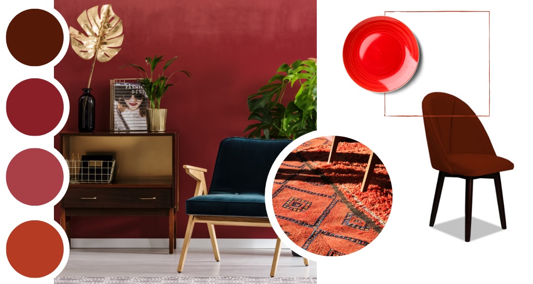
- Red: Often associated with energy, passion, and warmth. It can stimulate appetite and conversation, making it suitable for dining areas or spaces where social interaction is desired. However, excessive red can also create a sense of intensity.
- Blue: Known for its calming and serene qualities. Light blues can create a sense of tranquility, making them ideal for bedrooms or spaces where relaxation is important. Darker blues can convey stability and professionalism, suitable for offices.
- Yellow: Represents happiness, positivity, and energy. It can help in creating a cheerful and vibrant atmosphere. However, too much yellow might be overwhelming, so it’s often used as an accent color or in areas where you want to encourage activity.
- Green: Symbolizes nature, growth, and freshness. Green can provide balance and harmony, making it great for spaces where you want to create a calming environment, such as living rooms or home offices.
- Purple: Often associated with luxury, creativity, and spirituality. Lighter shades can be soothing, while darker shades can add a touch of elegance. It’s commonly used in bedrooms, lounges, or creative spaces.
- Orange: Energetic and enthusiastic, orange can create a warm and inviting atmosphere. It’s often used as an accent color to add vibrancy to a space, such as in kitchens or living rooms.
- Neutral Colors (White, Gray, Beige): These colors are versatile and can serve as a backdrop for other colors or design elements. They can create a clean and timeless look, making them popular choices for modern and minimalist designs.
- Black: Associated with sophistication and elegance, black can be used to create a dramatic effect. It’s often used in small doses to add contrast and depth to a space.
- Brown: Earthy and warm, brown can evoke feelings of comfort and security. It’s commonly used in furniture and wooden elements to add a sense of grounding.
Remember that individual perceptions of color can vary based on cultural, personal, and psychological factors. It’s important to consider the specific context, purpose of the space, and the feelings you want to evoke when choosing colors for interior design.